While I may not be able to show you my Art Journal Cover at the moment I can most certainly show you the other parts of my entry for my the Scrapbooking Memories Master Competition, now that all parts of the competition have run their course. I am so proud of these layouts and really glad for the opportunity to challenge myself with the tasks for this competition. I think they are a very clear representation of my style and approach to scrapbooking and they are just a whole lot of fun.
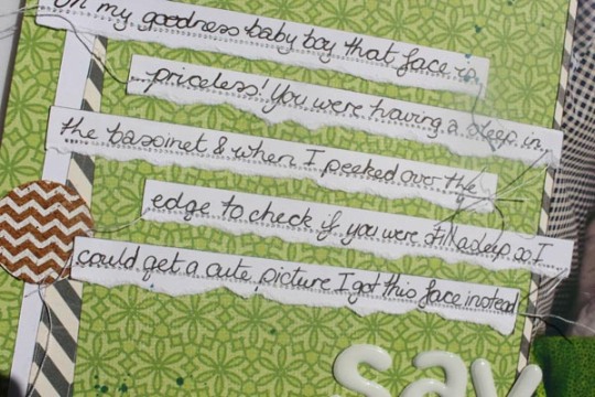
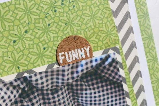 Let’s start with my layout for Task 1. If you need a refresher or are unfamiliar with Scrapbooking Memories and the Masters Task’s for 2014, this task was to scrap a single page layout with a 5×7 in photo that was engaging and had eye contact. Given those guidelines my thoughts immediately turned to this photo. Joseph was all of 5 month’s old at the time and I was attempting to just get a cute sleeping baby picture by snapping over the top of his bassinet and hoping for the best. Instead I managed to capture this fantastic and unexpected expression of surprise. I completely lucked out, and can’t believe that I actually caught it on camera. Definitely one of my favourite pics of all time so naturally it just had to be celebrated on a layout.
The awesome green paper is one from Kaisercraft and was chosen not only because it matched the blanket but to fit in with the colour scheme of Josephs baby album which is various bold shades of blue and green with a hint of yellow. I started off just thinking I would do a plain square mat around the edge of the layout but decided at the last-minute to skew the two centre papers to create a little more visual impact. I love how they convey the energy and sense of fun of this layout and I was looking for another excuse to get those fabulous puffy Thickers on a layout again too. Most of the time I pull them out to use but end up putting them away again because they seem a bit to casual but for this one they add just the right amount of impact and quirkiness. 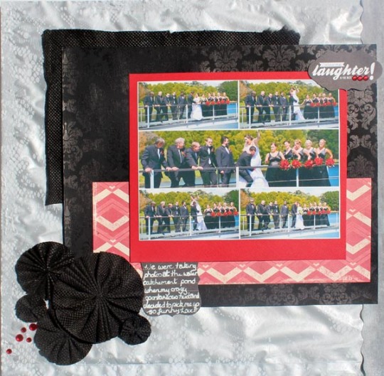
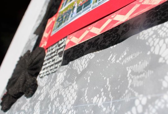
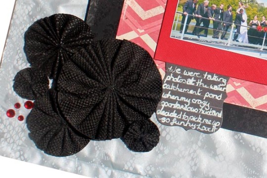 For Task two we were asked to scrap a layout using at least one unconventional item (non-papercrafting) and be as creative as possible. Since I’m not hugely worried about archival quality these days, for my take on it I chose to use a couple of shopping bags as my non-conventional items. Both the silver lace patterned background, the black fabric block and the fabric flowers are constructed from shopping bags. The lace look bag is a heavy duty plastic bag backed with chipboard to keep it sturdy, it was used to hold a purchase for our wedding and therefore was part of my wedding ephemera that I keep hoarding but haven’t actually used yet. The black fabric came from a reusable carry bag (like the green bags you see in the supermarket) that had sustained a few too many holes to be serviceable anymore. Since I’m not entirely sure what they’re made of I chose to mat my photo with some cardstock as a buffer between the photo and the shopping bag mat but what I really wanted them for was creating pleated flowers. I thought this would be a great use for this unique material.
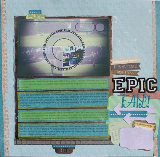
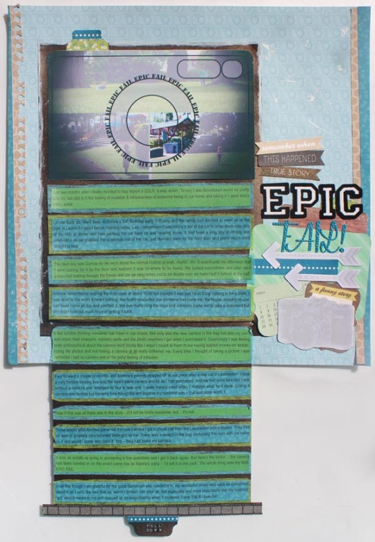
 They layout I love the most though has to go to my entry for Task 3 which was to make your journaling the focus of a page. Since we all know I am all about the words around here, that probably will come as no surprise. It was definitely an epic tale I had to tell for this layout – all about how my camera was ‘stolen’ shortly after I bought it so I had a lot to say on the subject. One of my big go-tos a few years ago was to experiment with paper engineering. I don’t often have the time to go to those lengths on a layout these days but my affection for some paper manipulation runs deep. The pull down tab is a rather simple one to master and simply requires a couple of slits in the backing paper to slide your pull down element up and down. Its a great technique to use when you have double the amount of journaling for your space allowance.
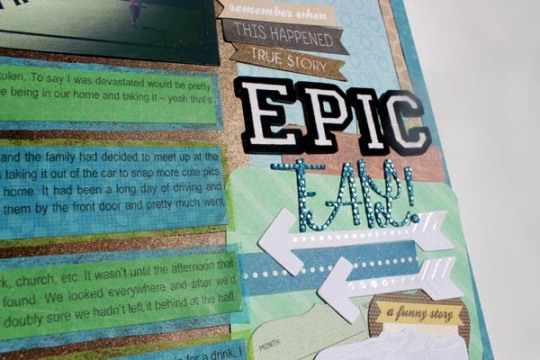
Another of my favourite parts of this layout was the photo manipulation done to fuse the three images into one. I overlayed the images with a simple camera motif and changed the opacity on all but one section of an image which highlights the actual scene of the crime. Throw in some die-cut shapes, an Amy Tangerine camera paper and some nude Heidi Swapp Colourshine pieces just to drive the point home and call it done. This one in particular I feel is indicative of my style. The colour combination, the photo manipulation, the paper engineering are all examples of where I’ve come from in my scrapping and the use of die-cuts and project life cards are just so me, right now. I so hope you enjoyed looking at these layouts as much as I enjoyed making them. Be sure to share what you think makes your style you in the comments below.
